To access the HUNTME referral program dashboard, enter the email and password you used during registration.
Fill out the form — it takes 2 minutes. A manager will contact you on Telegram, provide free training, and help you get your first result.

A prelander is often treated as a standard part of an affiliate funnel.
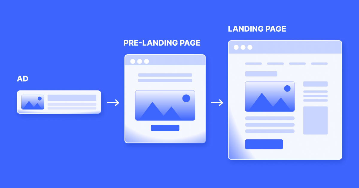
There is an ad, then a prelander, then an offer page. Many affiliates add this extra step automatically because they have seen it in other campaigns. But a prelander does not improve performance just because it exists. If it does not solve a specific problem, it simply becomes another place where the user can drop off.
A good affiliate prelander should have a clear purpose.
It can explain the offer, filter low-intent users, warm up cold traffic, create a better message match between the creative and the offer page, or prepare the user for the next step. In some funnels, a prelander can improve approval rate, paid rate, retention, and final net profit. In others, it only lowers the overall conversion rate and wastes traffic.
That is why the real question is not whether every affiliate offer needs a prelander.
Earn with HUNT ME — weekly payouts
The real question is: what problem should the prelander solve in this specific funnel?
A prelander is an intermediate page between the ad creative and the main affiliate offer page.
Its role is not always to sell harder than the landing page. In many cases, its role is to prepare the user for the next action.
A prelander can:
The landing page usually belongs to the advertiser or affiliate program and is built around the main target action: registration, subscription, payment, application, or another conversion event.
A prelander should not simply duplicate the landing page. If it repeats everything, overloads the user, and adds no new context, it only makes the funnel longer.
A strong affiliate funnel prelander acts as a bridge.
It connects the promise of the creative with the reality of the offer page.
Earn with HUNT ME — weekly payouts
A prelander is most useful when the user needs more context before taking action.
For example, cold traffic may click on an ad because the creative is interesting, but the user may not fully understand the offer yet. If that user is sent directly to a registration or payment page, many visitors will simply leave.
A prelander for affiliate offers is often useful when:
The goal is simple: the user should move to the offer page with a clearer understanding of what will happen next.
That is why a prelander is not just an extra screen. It is a tool for managing expectations.
A prelander is not always needed.
If the user already has high intent and understands what they are looking for, an extra page can hurt performance. This is especially true when the offer page already explains the product clearly and leads the user to action efficiently.
A prelander may be unnecessary when:
There is also a technical risk.
If ClickID, SubID, or UTM parameters are lost on the prelander, the page can break attribution and make performance analysis unreliable. In that case, the prelander does not only hurt conversion. It damages the entire tracking setup.
Using a prelander only because “affiliate marketers usually do it” is not a strategy.
It must have a clear role.
The funnel should feel logical:
creative → prelander → landing page → registration or payment.
Each step should continue the previous one.
If the creative promises one thing, the prelander explains another, and the offer page suddenly shows something different, the user loses trust.
This is the problem of message match in affiliate marketing.
A good message match means:
This is especially important in prelander affiliate marketing because aggressive pages can sometimes improve click-through rate to the offer page while lowering downstream quality.
For example, a prelander may increase the number of users clicking through to the offer. But if those users arrive with the wrong expectations, they may not pay, may cancel quickly, or may request a refund.
The top of the funnel looks better.
The bottom of the funnel becomes worse.
A good prelander should improve the whole funnel, not only the next click.
There is no universal structure that works for every offer.
But in most cases, a prelander should help the user understand several basic things:
At the same time, a prelander should not become a long article.
Its role is to answer the key questions that prevent the user from taking the next step consciously.
If the user does not understand why they should register, explain the value.
If the problem is trust, provide context.
If the offer is subscription-based, make sure the user is not led to believe that everything is a one-time free action if the next step involves a different model.
The fewer unpleasant surprises after the click, the better the chance of attracting not just a lead, but a higher-quality user.
The same prelander does not work equally well for every payout model.
In CPA offers, the focus is usually on a valid target action.
The prelander should help bring users who do not only register, but also match the offer requirements and pass approval. This means the page should filter out random users and prepare the right audience for the action that matters.
In RevShare offers, the logic is different.
The quality of the user matters over time. The user should understand the value of the product well enough to continue using it, generate revenue, and possibly stay beyond the first interaction.
A RevShare prelander should not chase low-quality curiosity clicks. It should attract users with stronger intent.
For subscription offers, expectation management becomes even more important.
If the user does not understand what happens after registration or payment, the risk of refunds, cancellations, and chargebacks increases.
A prelander for subscription offers often works best not as an aggressive push, but as a filter. It may send fewer users to the offer page, but the users who continue are more likely to understand the product and behave better after conversion.

One important point is often misunderstood: a lower click-through rate from the prelander to the offer page is not always bad.
Imagine that without a prelander, 1,000 users reach the offer page. With a prelander, only 700 continue.
At first glance, it looks like 300 users were lost.
But if those 700 users produce higher approval rate, higher paid rate, lower refund rate, and better retention, the final economics may improve.
A prelander can filter traffic through:
In other words, a prelander can reduce the number of users reaching the offer page while increasing the quality of the users who do.
That is why prelander performance cannot be measured only by the number of clicks.
In most cases, the structure does not need to be complicated.
A simple prelander can include:
The page should be focused.
The more unnecessary links, menus, blocks, and distractions it has, the higher the risk of losing the user.
For cold traffic, the page may need more explanation. For warm traffic, a short bridge between the ad and the offer page may be enough.
The goal is not to make the prelander long.
The goal is to make the next step feel clear.
One of the biggest mistakes is creating a page that looks attractive but has no strategic purpose.
It may look polished, get clicks, and still fail to help the user understand the offer.
Common prelander mistakes include:
The most dangerous situation is when the prelander improves the top of the funnel but damages the bottom.
For example, click-through rate to the offer page may rise by 25%, but paid rate may fall by 30%. If the affiliate looks only at clicks, the test may appear successful even though net profit is worse.
A proper prelander test should answer a specific question.
For example:
You can test:
The test must be fair.
Both versions should receive comparable traffic. One version should not get the best placements while the other gets leftover traffic.
Use separate SubIDs, keep GEOs separate, and wait for downstream data.
The winner is not the page that gets the first clicks.
The winner is the page that improves the economics of the funnel.
A prelander has upper-funnel and lower-funnel metrics.
At the top of the funnel, track:
But that is not enough.
Lower in the funnel, track:
This is where you can see whether the prelander improves traffic quality.
A high click-through rate does not prove that the prelander works. Sometimes it only means the page pushes everyone forward too aggressively.
A strong prelander should not only move users to the next step.
It should improve the quality of the users who reach that step.
The best signal is improvement in downstream metrics.
For example, after adding a prelander, the total number of leads may decrease by 10%, but approval rate may increase from 55% to 68%, paid rate may improve, and refund rate may drop.
That can be a stronger result than simply generating more registrations.
Signs that a prelander is helping include:
Stability matters.
One good day does not prove that the prelander is working. Results should be checked across several days and traffic segments.
Sometimes the intermediate page becomes the weak point.
Warning signs include:
In this situation, the prelander should not be kept only because it already exists.
If it does not add clarity, filtering, trust, or profit, it should be changed or removed.
This is especially important during funnel diagnosis. Sometimes affiliates start replacing the offer when the real problem is the prelander.
Without proper tracking, it is impossible to measure prelander performance.
Before launching, make sure that:
If traffic passes through a prelander and events are later assigned to an unknown source, the comparison is unreliable.
ClickID and SubID on prelanders are not small technical details. They are what allow the affiliate to understand which version actually produced revenue.
For offers where the economics depend on approval, payment, refunds, or rebills, postback should return more than just Lead events.
One universal page rarely works equally well across all countries and sources.
Different GEOs can have different:
Traffic sources are also different.
Search users may already understand what they are looking for. Push or pop traffic may be much colder. Native ads require a different warm-up logic. Warm traffic from communities may need less explanation but more trust.
A separate prelander version may be useful when the audience differs by:
This does not always mean building a completely new page for every segment.
Sometimes changing the headline, first screen, CTA, local context, and key explanation is enough.
But the message match must remain accurate.
A practical process looks like this:
The principle is simple:
hypothesis first, page second, test third.
A prelander should not be created just because a competitor has one.
Problems usually begin when the prelander has no clear task.
Typical mistakes include:
The most dangerous mistake is confusing more clicks with better performance.
If the page increases click-through rate but attracts users who monetize worse, it is not an improvement.
A strong prelander is needed when the user is missing context.
It connects the creative with the offer page, explains the mechanics, prepares the user for action, and filters out random traffic.
Sometimes it sends fewer users to the offer page. That is acceptable if approval rate, paid rate, retention, and net profit improve.
A weak prelander does the opposite. It adds friction, damages message match, slows loading, and creates expectations the offer cannot satisfy.
That is why an affiliate prelander should be evaluated across the whole funnel, not only by click-through rate.
If it helps users understand the offer, improves lead quality, and increases net profit, it deserves a place in the funnel.
If it only stands between the ad and the landing page without adding clarity, quality, or revenue, it should be improved or removed.
That is how a prelander stops being just an extra page and becomes a real tool for affiliate funnel optimization.
A prelander is an intermediate page between an ad creative and the main affiliate offer page. It helps explain the offer, prepare the user for the next step, filter low-quality traffic, and improve message match.
You may need a prelander when traffic is cold, the offer requires explanation, the landing page is too direct, the creative and offer page do not match well, or you need to improve traffic quality before sending users to the offer.
A prelander may be unnecessary when traffic is already high-intent, the offer page converts well directly, the path to action is already clear, or the extra step lowers conversion without improving approval rate, paid rate, retention, or net profit.
Measure both upper-funnel and lower-funnel metrics: bounce rate, time on page, click-through rate, lead conversion rate, approval rate, paid rate, EPC, refund rate, retention, rebills, net revenue, and net profit.
A prelander can improve paid rate by explaining the offer clearly, setting correct expectations, filtering out random users, improving trust, and sending more qualified users to the offer page.
Common mistakes include weak message match, unclear CTA, slow loading, poor mobile experience, aggressive promises, missing localization, lost ClickID or SubID, no direct-to-offer test, and judging performance only by clicks.
Registration takes 2 minutes. No experience needed — we'll teach you everything.
Just fill out the form
Registration takes 2 minutes. No experience needed — we'll teach you everything.